
In today’s business environment, where first impressions are often formed in mere seconds, the design of your office reception area plays a vital role. From layout to furniture, every element contributes to the overall perception of your brand. However, one aspect that is often underestimated but highly impactful is your reception signage.
Minimalism, as a design philosophy, has become a leading trend in modern workspaces. It reflects a refined sensibility—one that prioritises clarity, sophistication, and intentionality. When translated into signage, minimalism communicates more by displaying less.
In this blog, we explore how minimalist reception signs can redefine the identity of your office, improve visitor experience, and offer branding cohesion—all while showcasing how materials like acrylic printing and thoughtful layout decisions play an integral role.
What Is Minimalist Design in Office Signage?
Minimalist design, at its core, is about simplifying form and function to only what’s essential. It shuns ornate detailing and excessive decoration in favour of clean lines, limited colour palettes, and deliberate use of space.
When applied to office signage, minimalism means:
- Clean, sharp fonts without excessive embellishment
- Simple logo placement or brand name
- Minimal colour use, often restricted to monochrome or subtle accent hues
- Focus on legibility and placement, not visual noise
This style contrasts significantly with older, more elaborate signage, which often tried to impress with complexity. Instead, minimalism impresses with precision.
Why Minimalist Reception Signs Are a Perfect Fit for Modern Offices
Modern office design embraces openness, neutral tones, and functionality—all of which are mirrored in minimalist signage. Here’s why this trend works so well:
1. Design Harmony
Most contemporary offices use minimalist interiors—glass walls, wooden flooring, exposed materials. Minimalist signs naturally complement this aesthetic without standing out awkwardly.
2. Brand Maturity
A sleek, minimalist sign suggests professionalism and confidence. It shows that the brand understands its identity and doesn’t need gimmicks to express it.
3. Reduced Visual Clutter
Overly decorative signs can make a space feel chaotic. Clean signage promotes a calming atmosphere, helping both employees and visitors feel more focused.
4. Improved Visitor Experience
Wayfinding becomes intuitive when signs are legible and placed strategically. This streamlining improves the flow of movement within your space.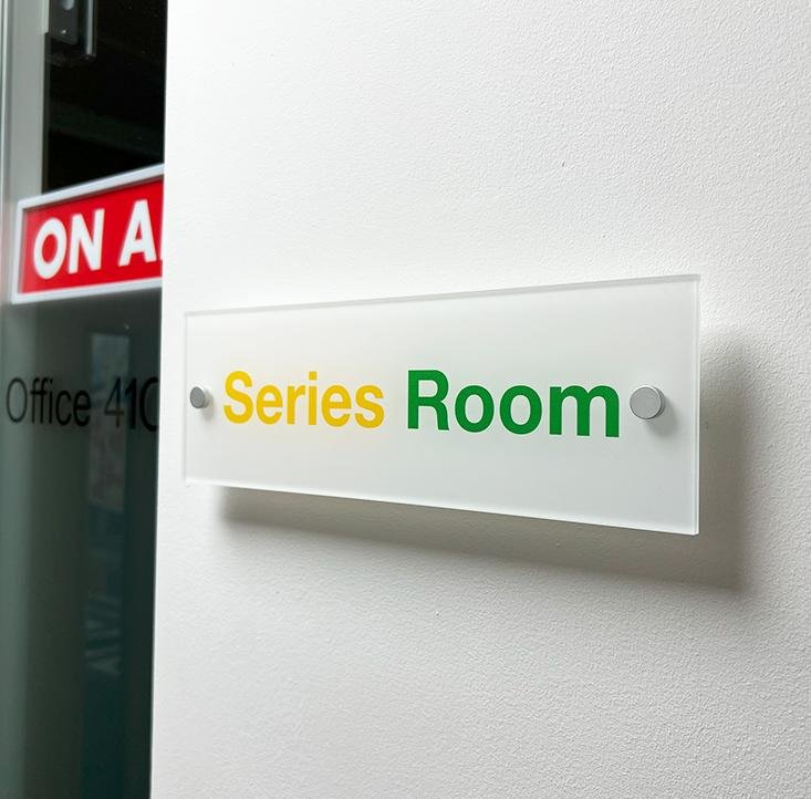
Popular Minimalist Materials and Finishes
Material choice is critical in defining the aesthetic of your signage. Among the most popular choices, acrylic printing stands out for its crisp presentation and adaptability.
Acrylic
Acrylic signs offer smooth surfaces, edge-polished finishes, and compatibility with both direct-to-substrate and reverse printing. They're durable, lightweight, and can be mounted without visible fixings for a floating effect.
Brushed Aluminium
For industrial or tech environments, aluminium signs deliver a premium look. Their subtle texture and resistance to wear make them a favourite for corporate branding.
Glass
When paired with soft backlighting, glass signage brings a sense of prestige and transparency. It's commonly used for executive-level reception areas.
Wood
Used less frequently, but when paired with laser-etched logos or typography, wood creates a grounded, natural impression suitable for creative agencies or eco-conscious firms.
In all cases, acrylic printing offers a sleek, clean visual output, with the added advantage of colour stability over time, making it ideal for minimalist signage applications.
Layout and Typography Choices for Minimal Reception Signs
Typography and layout may seem like small details, but they can make or break the impact of your signage.
Font Choice
Minimalist signs favour sans-serif fonts such as Helvetica, Futura, or Gotham. These fonts are highly legible and convey a clean, modern tone.
Spacing and Alignment
Generous use of white space and symmetrical alignment add to the clarity and orderliness of the sign. Avoid cramming elements together—less is truly more.
Logo Positioning
Logos are typically placed at the top centre or left side of the signage. This mirrors natural reading habits and ensures brand visibility without intrusion.
Effective signage ensures legibility from multiple angles and distances. Choose font sizes based on the viewing range—at least 50mm letter height for signs viewed within 2 metres.
Colour Palette Strategies in Minimalist Sign Design
When designing a minimalist reception sign, the colour palette should be treated with care. Loud or conflicting hues dilute the minimalist essence.
Monochrome Tones
Black and white offer a timeless combination. Monochrome signs with frosted acrylic or matte black backing are often used for corporate settings.
Soft Pastels and Neutrals
If colour is desired, pastels such as sage green or dusty blue work well without overwhelming the eye. Pair them with white or grey text for balance.
Contrast with Restraint
Contrast should be used selectively—such as white text on a charcoal background—to ensure readability while retaining the soft visual tone.
The colours should align with both your interior theme and branding guidelines to maintain consistency across your visual identity.
Best Placement Options for Reception Signs
A minimalist design is most effective when combined with smart placement. Consider the following options:
- Behind the Reception Desk: This remains the most common location, ensuring that the brand is front and centre when visitors arrive.
- Entrance Walls: A subtle wall-mounted sign adjacent to the main door provides early engagement.
- Glass Partitions: Using frosted acrylic printing on glass walls can extend brand presence without adding clutter.
- Freestanding Signs: Slim totems with minimal messaging near entry points can serve both branding and wayfinding purposes.
Enhance these signs with ambient or hidden LED lighting to maintain a modern feel without detracting from the simplicity.
Incorporating Directional Elements Without Disrupting Minimalism
Functionality doesn’t have to compromise visual appeal. If your reception area includes navigation elements, they should align with your minimalist aesthetic.
Use clear arrow indicators, discreet iconography, and simple font styles to maintain clarity.
For instance, integrating meeting room signs in the same design language as your reception signage ensures visual continuity. Frosted acrylic with clean directional cues can double up as both branding and wayfinding tools.
Avoid mixing too many styles or adding unnecessary detail. The goal is coherence.
Customisation Tips for Businesses Seeking Minimalism
Minimalist doesn’t mean “one-size-fits-all.” Customising your signage is essential to align with your brand.
Consider the Following:
- Thickness: Thicker acrylic (5mm or more) adds a more substantial look
- Finish: Opt for matte over glossy if avoiding reflections is important
- Mounting Hardware: Use hidden or stainless steel fixings for cleaner presentation
- Etching or Reverse Printing: These subtle techniques help add texture without overpowering the design
Modular signs with interchangeable panels allow companies to expand or change messaging while keeping the main design intact.
Common Mistakes to Avoid in Minimalist Signage
While minimalism aims for simplicity, poor execution can make signage ineffective.
1. Oversimplification
Removing too many design elements may render your sign vague or confusing.
2. Poor Font Choices
Decorative or cursive fonts ruin legibility and dilute the minimalist tone.
3. Neglecting Brand Identity
Minimalist doesn’t mean generic. Your signage should still reflect your company’s personality.
4. Ignoring Functionality
A beautiful sign that’s hard to read or poorly placed fails its purpose.
By balancing aesthetics with practicality, you can avoid these pitfalls and create signage that’s both beautiful and useful.
Conclusion
Minimalist reception signs offer a powerful yet understated way to express your brand identity. By focusing on clean lines, premium materials like acrylic printing, and strategic placement, modern offices can achieve an elevated look that supports professionalism, wayfinding, and visual harmony.
Incorporating elements such as matching meeting room signs only enhances the sense of cohesion, ensuring that every visitor journey feels intentional and polished.
If you're looking to design or upgrade your office signage with minimalism in mind, Board Printing Company offers tailored solutions that blend style, functionality, and brand alignment.
Comments